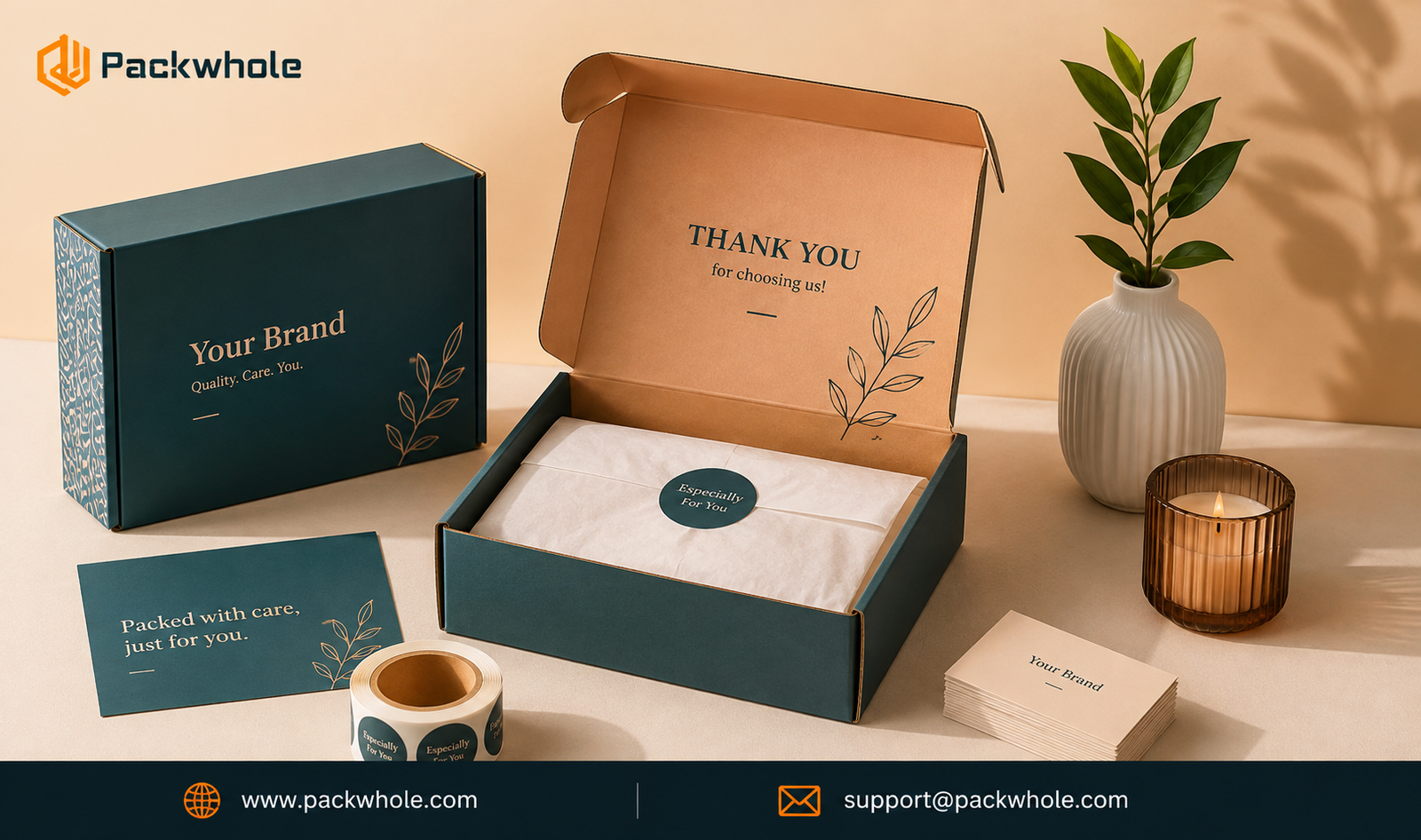
Open enough packages and you start to notice a pattern. Some arrive in a plain brown box with a shipping label slapped on top. Others arrive looking like they were designed on purpose — color-matched tape, a logo placed with intention, tissue paper that actually complements the product inside. The product might be identical. The impression is not.
That gap is packaging design, and it’s one of the fastest ways a small business can look like a bigger one. You don’t need a warehouse full of custom equipment or a six-figure packaging budget to get there. You need a mailer box that reflects a few deliberate decisions, made consistently, every time an order ships.
This guide walks through what actually separates a “branded” mailer box from a box with a logo on it — and how to design one that holds up from the design file to the customer’s doorstep.
What Makes a Mailer Box Look “Branded”?
A branded mailer box isn’t defined by how much is printed on it. Some of the most memorable packaging in e-commerce is minimal — a single logo, one accent color, and a lot of empty space used well.
What actually reads as “branded” comes down to consistency and intention. Every element — color, typography, box style, even the tape — looks like it was chosen by the same person, for the same reason, and shows up the same way on every order.
A few markers separate branded packaging from generic packaging:
- The color palette is limited and consistent, not a grab bag of whatever looked good at the time.
- The logo is sized and placed with purpose, not centered by default because no one thought about it.
- The box style suits the product instead of being whatever was cheapest or easiest to source.
- The interior of the box gets the same attention as the exterior.
- Nothing on the box feels like an afterthought, including the tape and any inserts.
None of this requires elaborate design. It requires the same set of choices applied consistently, order after order.
Start With a Clear Brand Identity
Mailer box design falls apart when it starts with the box instead of the brand. Before opening a design file, a business needs answers to a few basic questions: What does this brand stand for? What tone does it use — playful, minimal, luxury, rugged? What three to five colors represent it, and in what typeface?
If those answers already exist in a brand guide, packaging design becomes much faster — it’s a matter of translating an existing identity onto a three-dimensional object. If they don’t exist yet, packaging is actually a reasonable place to force that clarity, since a box has far less room for indecision than a website does.
A useful exercise: describe the brand in three adjectives before designing anything. A skincare brand might land on “clean, calming, confident.” Those adjectives should show up in the color choices, the type, and the copy on the box — not just in a mission statement no one reads.
Choose the Right Box Style and Size
Mailer boxes aren’t one-size-fits-all, and the style itself sends a signal before a single color gets applied.
Common options include:
- Tuck-top or tuck-front mailer boxes — simple, cost-effective, and common for apparel, accessories, and smaller retail items.
- Two-piece rigid boxes — a lid-and-base structure often used for higher-end products where the unboxing moment matters, like jewelry or electronics.
- Corrugated shipping mailers — sturdier stock built to survive transit, well suited to heavier or fragile products.
Size matters just as much as style. A box that’s too large for the product forces extra void fill, adds shipping cost, and creates a loose, unfinished unboxing experience. A box sized close to the product looks intentional and protects better with less packaging material.
A good rule of thumb: choose the smallest box that still protects the product and leaves enough room for any inserts, without needing to overstuff it with filler.
Use Your Brand Colors Strategically
Color is usually the first thing a customer notices, often before they register the logo. It’s also where a lot of packaging designs go wrong — not by choosing bad colors, but by using too many of them.
A branded mailer box typically works best with one to three colors: a primary brand color, a neutral (often the natural kraft or white of the box stock), and sometimes an accent. That restraint is what makes packaging look designed rather than decorated.
It’s also worth understanding the difference between color on a screen and color on a printed box. Screens use RGB; print uses CMYK or, for exact brand-color matching, Pantone (PMS) spot colors. A brand’s signature color might shift slightly once it’s printed on kraft versus white stock, so it’s worth requesting a physical proof before a full production run, especially for a first order.
Design a Memorable Logo and Visual Hierarchy
The logo doesn’t need to dominate the box to be effective — it needs to be placed where the eye naturally lands.
Visual hierarchy is the order in which someone notices elements on the box: what they see first, second, and third. On most well-designed mailers, the logo comes first, a supporting brand element or color comes second, and finer details — taglines, care instructions, small icons — come last.
A common mistake is centering everything by default, which creates a static, symmetrical layout that lacks personality. Off-center logo placement, an asymmetrical color block, or a wraparound design that continues across the seams of the box can all make a mailer feel more considered without adding printing cost.
Whatever the layout, the logo file itself needs to be print-ready: vector format (AI, EPS, or a high-resolution PDF), not a low-resolution image pulled from a website. A pixelated logo undoes a lot of otherwise good design work.
Choose Typography That Matches Your Brand
Typography carries tone the same way color does. A serif typeface reads differently than a bold sans-serif or a handwritten script, even when they say the exact same words.
For mailer box design, legibility matters more than it does on a screen, since the type has to hold up at arm’s length, sometimes on a curved or textured surface. A general guideline: stick to one or two typefaces total, use the more decorative one sparingly (a logo or a single line of copy), and rely on a clean, legible typeface for anything functional, like care instructions.
If the brand’s primary typeface is very thin, script-heavy, or intricate, it may need a slightly bolder or simplified version for packaging, particularly on darker or busier backgrounds.
Add Brand Messaging and Storytelling
The exterior of the box gets a customer’s attention. The message inside earns their loyalty.
Short, well-placed copy can do a lot of work on packaging: a one-line brand tagline, a short note about sourcing or sustainability, care instructions, or a simple “thank you.” This doesn’t need to be lengthy — in fact, brevity usually reads as more confident.
Some brands use a QR code on the box linking to a welcome page, a how-to guide, or a loyalty program signup. It’s a low-effort way to extend the relationship past the unboxing moment, as long as it’s used sparingly and doesn’t compete visually with the design.
Consider the Inside of the Box and the Unboxing Experience
It’s easy to focus entirely on the exterior of a mailer box and forget that the inside is where the customer actually spends their attention.
A printed interior — even something as simple as a single color or a repeated pattern — creates a moment of surprise that a plain brown interior doesn’t. It’s also one of the more shareable parts of packaging design, since unboxing photos and videos usually capture the inside of the box as much as the product itself.
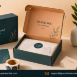
If a fully printed interior isn’t in the budget yet, even a branded strip of tape sealing the box, or tissue paper in a brand color, can carry some of that same effect at a much lower cost.
Use Inserts, Stickers, Tissue Paper, or Other Branded Elements
Not every business needs a fully custom-printed box to look established. Smaller-order or newer businesses often build branded packaging in layers, starting with lower-cost elements:
- A branded sticker or wax seal on a plain kraft box
- Custom tissue paper in a signature color
- A printed thank-you card or discount insert
- Branded tape as the primary color statement
These layered elements let a brand look intentional and consistent well before it’s ready to commit to a full custom mailer print run — and they’re a natural next step to build on once order volume justifies fully custom packaging.
Balance Aesthetics With Functionality
A mailer box that looks great but arrives crushed does more damage to a brand than plain packaging ever would. Design and durability aren’t separate decisions — they need to be solved together.
A few functional questions worth answering before finalizing a design:
- Is the board weight (often measured in GSM or caliper) appropriate for the product’s actual weight?
- Does the box style close securely without relying on excess tape?
- Will the printed finish (matte, gloss, or uncoated) hold up to handling during transit without scuffing or fading?
- Has a sample gone through an actual test shipment before a full production order?
Packaging that photographs well but fails in transit isn’t a design win. The goal is a box that looks intentional and survives the trip it was built for.
Common Mailer Box Design Mistakes to Avoid
A few recurring issues show up across a lot of first-time custom packaging projects:
- Too many colors or fonts, which makes the box feel busy instead of branded.
- Low-resolution logo files, which print blurry or pixelated at box scale.
- Ignoring the dieline, resulting in text or logos that get cut off, distorted, or land awkwardly on a fold or seam.
- Designing only the front panel and treating the sides and interior as an afterthought.
- Choosing a box size based only on the product’s dimensions without accounting for padding, inserts, or protective material.
- Skipping a physical proof and discovering color or sizing issues only after a full production run.
Most of these are easy to catch with a second look before a file goes to print — but expensive to fix afterward.
How to Prepare Artwork for Custom Mailer Box Printing
Print-ready artwork looks different from a typical digital design file, and getting it right up front avoids delays and reprints.
A few standard requirements:
- Use a dieline template. This is the flat, unfolded outline of the box showing where every fold, panel, and seam will land. Design should happen directly on top of it.
- Work in vector format for logos and line art (AI, EPS, or vector PDF) so nothing loses quality when scaled to print size.
- Set colors correctly — CMYK for standard four-color process printing, or Pantone (PMS) codes when exact color matching is required.
- Keep a safety margin around the edges and folds, since anything too close to a seam risks being cut off or distorted.
- Include bleed — extending background colors or images slightly past the edge of the design so there’s no thin white line after trimming.
- Request a physical proof or sample before committing to a full production run, especially for a first design.
A packaging provider that offers design support or file review before printing can catch a lot of these issues before they become a costly reprint.
Why Custom Mailer Boxes Are Valuable for E-Commerce Brands
For an e-commerce or DTC brand, the mailer box often does a job no other part of the business can: it’s the one piece of the brand that shows up physically, in the customer’s hands, disconnected from a screen.
Custom mailer boxes give a brand a few practical advantages generic packaging can’t:
- Brand recognition. A consistent, well-designed box becomes recognizable on a doorstep before it’s even opened.
- Perceived value. Thoughtful packaging design signals quality, which can shape how a customer feels about the product inside before they’ve used it.
- Shareability. Distinct unboxing experiences are more likely to end up photographed or shared, which is effectively free exposure.
- A cohesive customer journey. Packaging that matches the website, emails, and product design reinforces the same brand story at every touchpoint, rather than breaking it at the final step.
None of this requires a massive redesign. It requires the same brand decisions — color, type, tone — applied with the same discipline to the box as to everything else the brand puts in front of a customer.
Conclusion
A mailer box is often the last thing a customer sees before they interact with a product — and the first physical object that represents a brand outside of a screen. Getting the design right isn’t about adding more to the box. It’s about making deliberate, consistent choices and carrying them through from the logo file to the interior lining.
For businesses ready to move from generic shipping boxes to something that actually looks like a brand, working with a packaging partner that understands both the design side and the production side makes the process considerably smoother. Packwhole works with e-commerce and DTC brands on custom mailer boxes and packaging, from early design decisions through print-ready artwork and production — helping businesses turn a shipping box into a box that actually looks like theirs.