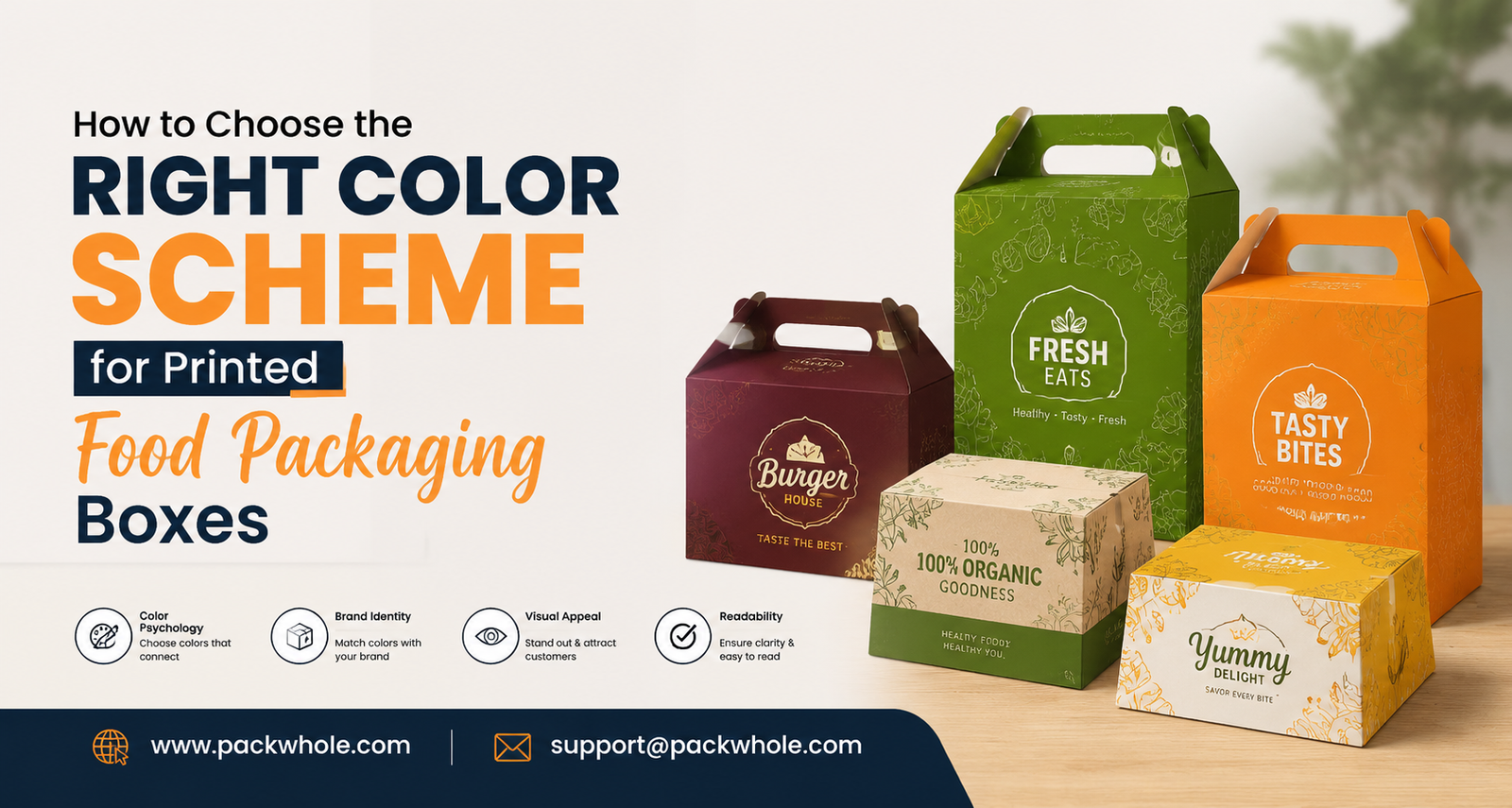
Color is often the first thing a customer notices about a product, before they read a label or check an ingredient list. On a crowded shelf or in a stack of delivery orders, printed food packaging boxes have only a second or two to catch someone’s eye and signal what’s inside. That impression is shaped almost entirely by color, which is why choosing the right palette is one of the most important decisions in any food box design.
For food brands, a color scheme isn’t decoration. It’s a strategic choice that affects branding, customer psychology, shelf visibility, and how a product is positioned against competitors. This guide covers how to think through color for custom food packaging boxes, from understanding your brand to building a palette that holds up once printed.
Why Color Matters in Printed Food Packaging Boxes
Customers form impressions of packaging almost instantly, often before consciously registering any text or imagery. Color reaches people on a more immediate level than words, which is why it plays such a large role in how food products are perceived.
Warm, saturated colors often suggest indulgence or bold flavor, while soft, muted tones tend to read as gentle or health-conscious. Cool colors can communicate freshness or calm, and darker palettes are frequently linked to richness or premium quality. These aren’t fixed rules, but they’re patterns that matter when packaging needs to work at a glance.
Color also sets expectations. When a palette matches what’s actually inside the box, it builds trust. When it doesn’t, it can create a subtle sense of mismatch, even if the customer can’t quite explain why.
Understand Your Food Brand Before Choosing Colors
Before browsing color swatches, get clear on a few fundamentals about the brand itself. Packaging colors shouldn’t be chosen in isolation from the rest of the brand strategy.
Start with the target audience. A bakery aiming at busy parents looking for an affordable treat will likely want a different palette than one positioning itself as artisan and small-batch. Consider the food category too: comfort foods, spicy snacks, organic products, and premium desserts each tend to draw from different visual territory.
Pricing position matters as well. Budget-friendly, high-volume products often use bright, high-energy colors to stand out quickly, while premium items tend toward restrained, sophisticated palettes that suggest quality over quantity. Finally, consider brand personality: playful or serious, traditional or modern. Answering these questions first turns color selection from “what do I like” into “what supports this brand.”
Learn the Psychology of Food Packaging Colors
Color psychology isn’t an exact science, but certain associations are common enough to be useful starting points. Context, typography, and imagery still shape how a color is ultimately perceived.
Red is energetic and appetite-stimulating, common in fast food and snacks. Yellow feels cheerful and affordable, with strong shelf visibility. Orange blends red’s energy with yellow’s warmth, often used for casual, indulgent snack packaging. Green signals freshness and natural ingredients, making it common on organic and plant-based products. Blue isn’t strongly appetite-driven but communicates trust and calm, working well for beverages and dairy. Brown suggests warmth and heartiness, fitting for bakery items, coffee, and chocolate. Black conveys premium quality and sophistication, often chosen for gourmet or luxury snacks. White reads as clean and minimal, frequently used as a supporting background. Pink suggests sweetness and playfulness, common in bakery and dessert packaging. Purple often signals indulgence or a touch of luxury.
These associations shift by culture and market, so treat them as starting points to test rather than rules to apply automatically.
Match Your Color Scheme to Your Food Product
General color psychology is a starting point, but the strongest choices come from the specific food category. Bakery packaging often benefits from warm, soft tones like cream, brown, or blush pink that suggest comfort. Fast food and takeout packaging leans on bold reds, yellows, and oranges for visibility and appetite appeal.
Organic and natural products often favor greens, browns, and muted earth tones, sometimes paired with kraft paperboard for an unbleached look. Snack packaging tends to use bright, high-contrast combinations to stand out in a crowded aisle, while frozen food packaging often relies on cooler blues and whites to suggest freshness. Premium chocolates and desserts lean toward darker, richer palettes such as deep browns or jewel tones, and coffee packaging typically uses warm browns and deep neutrals that echo the product itself. In every case, the palette should feel like a natural extension of the product, not an arbitrary layer on top of it.
Choose Colors That Strengthen Brand Recognition
A strong color scheme does more than make one box look good. It should help customers recognize the brand instantly across every touchpoint, from custom food packaging boxes to bags, cups, labels, and inserts.
This means selecting a core set of colors and applying them deliberately everywhere, rather than letting each product line develop its own look. A coffee shop that uses the same primary and accent colors on its cups, bags, and takeout boxes builds recognition that customers absorb over time, sometimes even without a visible logo. That consistency is what turns a palette into a real brand asset for branded food packaging.
Think About Contrast and Shelf Visibility
Even a well-chosen palette can fail without enough contrast between key elements. Product names, logos, and important messaging need to stay readable at a glance, especially in a retail setting.
Low-contrast combinations, like light gray text on a pale background, can look elegant on screen but become hard to read once printed and placed on a shelf. It helps to check how packaging looks from a few feet away and under different lighting, since store lighting rarely matches a design studio.
Watch for clutter too. Too many colors or competing design elements can weaken an otherwise strong palette. A cleaner composition built around a few well-chosen colors, with clear contrast, tends to stand out more than a busy design trying to do too much.
Consider Printing and Material Differences
A color that looks perfect on screen doesn’t always translate the same way once printed. Printing process, ink, paperboard color, coatings, and finishes can all shift how a color appears on the final product. A matte finish can mute a color slightly compared to a glossy one, and unbleached kraft board renders colors differently than bright white stock.
This is why reviewing physical proofs matters before committing to full production. Working with an experienced packaging manufacturer who understands how different materials and finishes affect color output helps avoid surprises. Matching a brand’s intended colors to the right combination of material, ink, and finish is exactly the kind of detail Packwhole works through with clients when developing custom printed packaging.
Use Color to Communicate Premium or Sustainable Positioning
Color can support a brand’s positioning, though it works best alongside material and design choices rather than on its own. Minimalist palettes with generous white space often read as premium, while earthy, muted tones paired with kraft or recycled-look materials can support a natural or eco-conscious impression.
It’s worth being careful here: color alone doesn’t make packaging sustainable, and pairing green tones with non-recyclable materials can come across as misleading. Color works best as one part of a broader strategy that includes material selection and structural design working together toward a consistent message.
Avoid Common Food Packaging Color Mistakes
A few recurring mistakes tend to weaken otherwise promising designs: using too many colors at once, choosing colors without considering the target audience, ignoring brand consistency across formats, and settling for poor contrast that hurts readability. Following short-term trends without considering brand fit can leave packaging feeling disconnected or dated quickly, as can choosing colors that conflict with the food itself, such as a palette that unintentionally suggests artificiality on a product marketed as natural. Skipping printed proofs and assuming screen colors will translate perfectly rounds out the list.
How to Build a Balanced Color Palette for Food Boxes
A practical way to build a palette is to think in terms of roles rather than simply picking colors that look nice together. A dominant color anchors the design and carries most of the visual weight. A supporting color complements it and adds depth. An accent color, used sparingly, highlights specific details like a badge or key piece of information. A neutral or background color, often white, cream, or kraft, gives the design room to breathe.
This structure keeps a palette from feeling flat or chaotic, and it gives a brand flexibility across formats, since the same roles can apply consistently whether the surface is a box, a bag, or a label.
Test Your Color Scheme Before Production
Before full-scale production, test the palette thoroughly. Digital mockups are useful early on, but they rarely capture exactly how a color will look once printed on real material. Physical samples and printed proofs give a far more accurate sense of the final product, including how colors shift under different lighting, such as store fluorescents versus daylight.
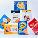
It also helps to place the proposed packaging next to competing products, either physically or in photos, to see how it holds up in context. A palette that looks strong in isolation can blend in or clash once it sits among other packaging on a real shelf, which makes this kind of side-by-side comparison a valuable last check.
Create Food Packaging That Looks Good and Supports Your Brand
Color is one of the most powerful tools available for printed food packaging boxes, but it works best as part of a complete design strategy rather than a standalone decision. Structure, typography, imagery, materials, and finishing choices all interact with color to shape the final impression a customer forms. A strong palette paired with a weak structural design rarely delivers the same result as packaging where every element has been considered together.
This is where working with a packaging partner who understands both design and production makes a difference. Packwhole works with businesses to develop custom printed food boxes that bring color, structure, and material choices together into packaging that genuinely represents a brand.
Start Your Custom Food Packaging Project with Packwhole
Choosing the right color scheme is a meaningful step toward packaging that reflects your brand and connects with the customers you’re trying to reach, but it’s only one part of a larger design and production process. Material selection, structural design, printing methods, and finishing options all affect how your final packaging looks, feels, and performs on a shelf or in a delivery order.
Packwhole helps food brands, bakeries, restaurants, cafés, and retail businesses turn these decisions into custom printed food packaging boxes that are professionally designed, structurally sound, and built around a consistent brand identity. Whether you’re launching a new product line or refreshing existing packaging, working with an experienced packaging partner helps ensure your color choices translate accurately from concept to finished box, without compromising protection or print quality along the way.